Glovo • Redesign
Order tracking
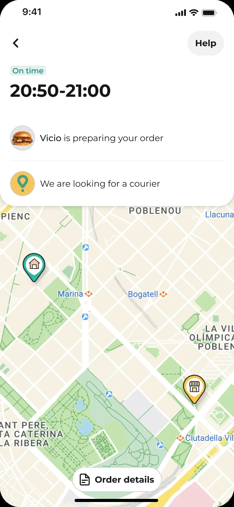
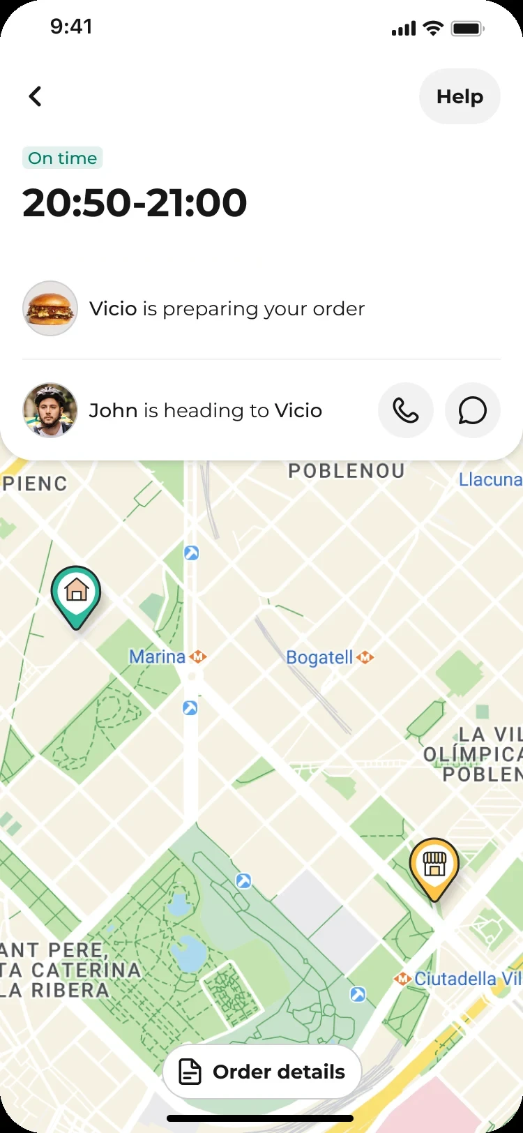
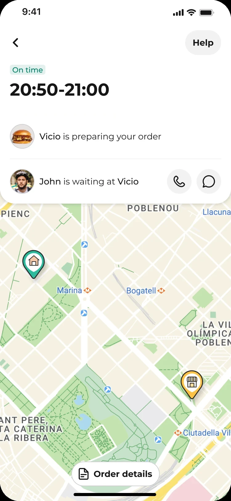
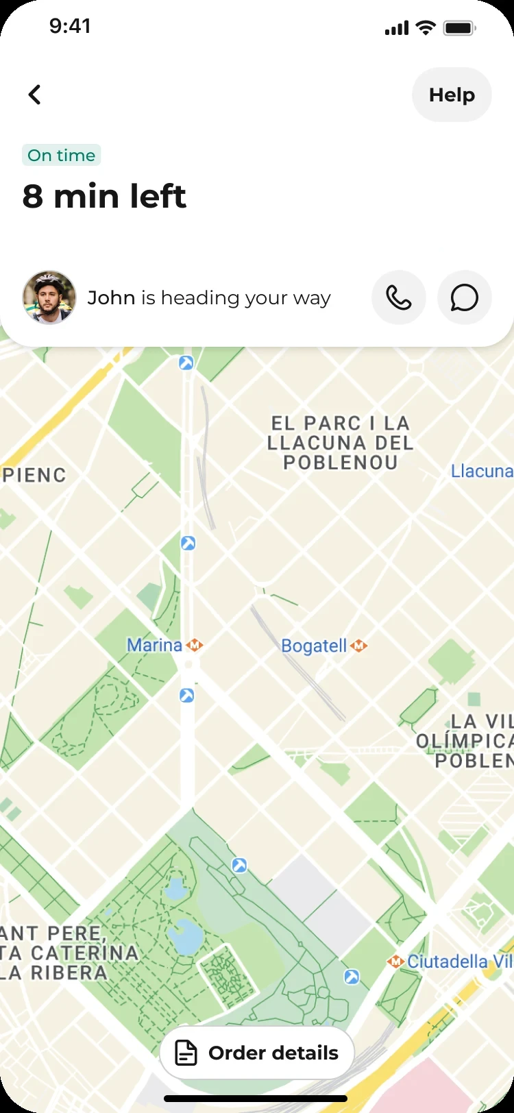
Redesigning order tracking to show what’s happening at the restaurant and with the courier, while making room for ads.



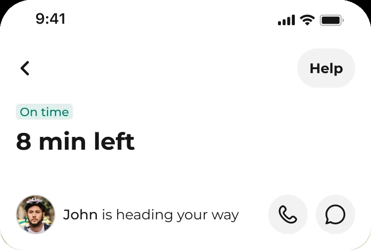
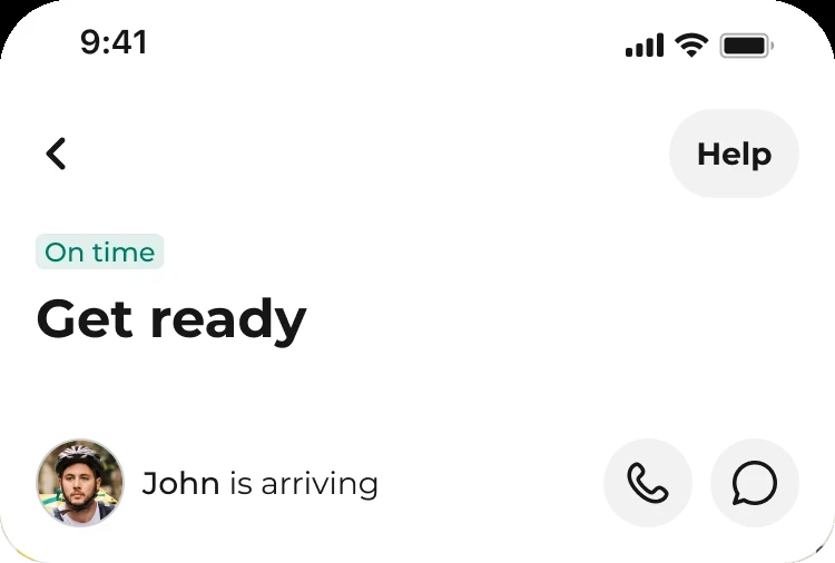
Outcomes of the redesign
Lower contacts
Being open about the courier delivering another order on the way cut contacts on bundled orders by an estimated 10–15%.
Earlier cancellations
Showing the map right after ordering moved cancellations from late to early, before the food was prepared.
Room for revenue
The restructured screen made room for ads worth an estimated €1–2M.
Figures are rough estimates shared verbally after the rollout; exact numbers are confidential.
Client
About Glovo
Glovo delivers food, groceries and almost anything else across 20+ markets. Every order depends on a partner and a courier working at the same time, which is exactly what order tracking has to explain.
01 The problem
Challenging architecture
The order tracking screen had been designed for simple status updates.
As the delivery experience became more complex, it struggled to explain what was happening, communicate delays, and accommodate new commercial content. Have we reached the local maximum?
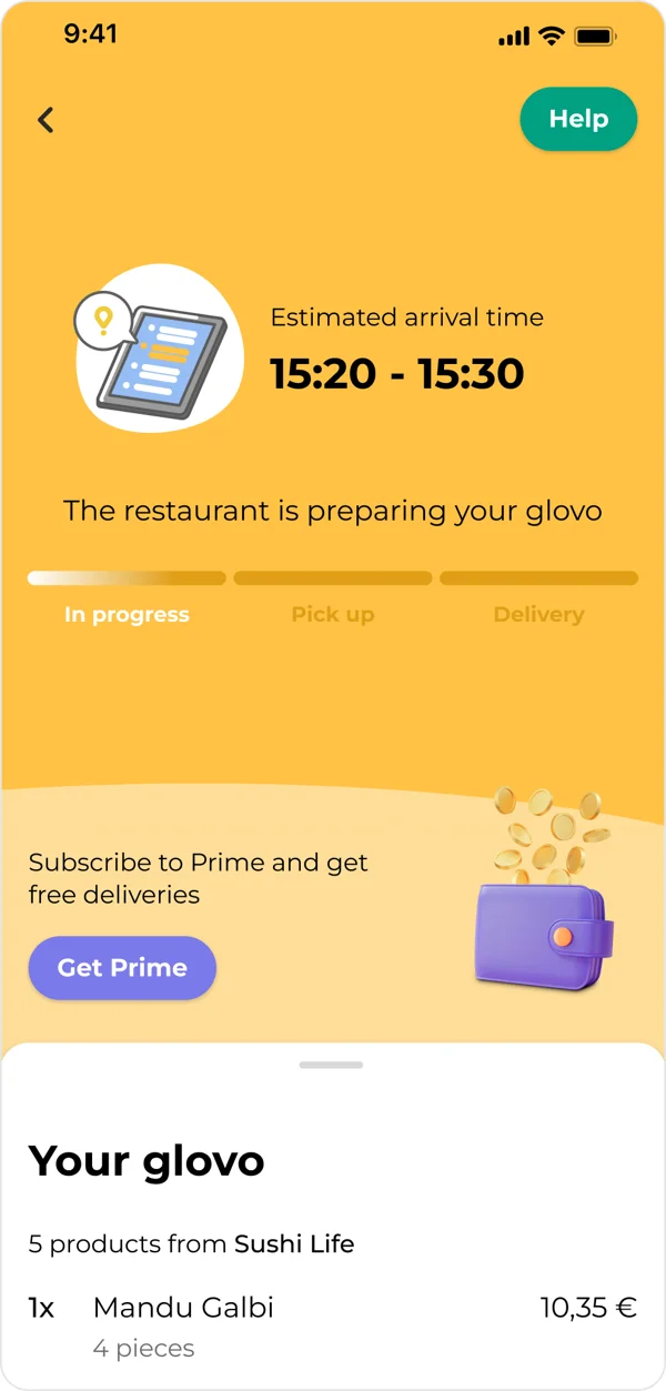
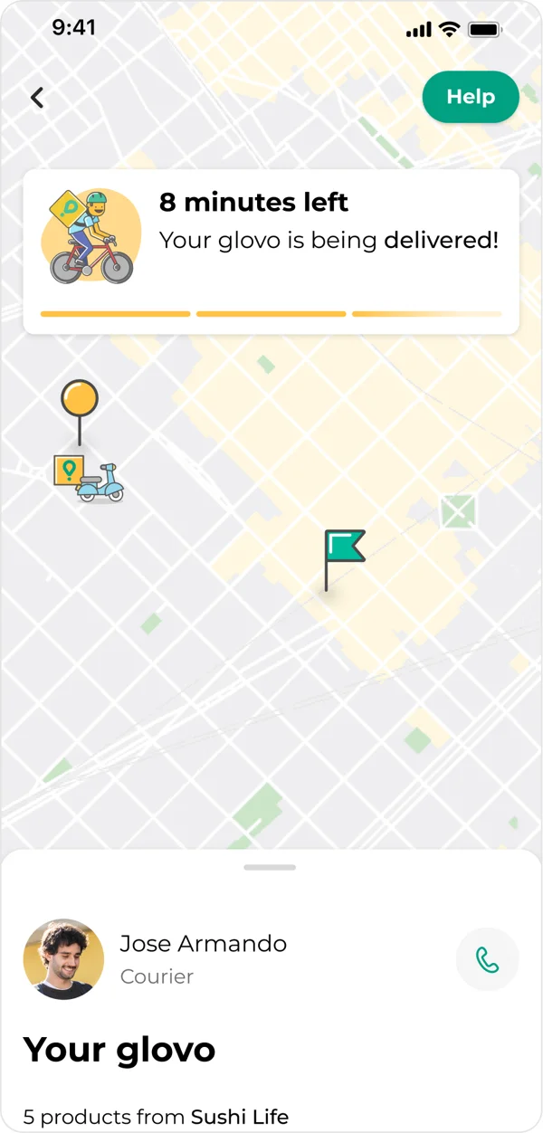
Unclear progress
Inconsistent stage names, and a “Pickup” milestone that could last 10–15 minutes.
Incomplete visibility
A single status couldn’t explain what was happening at the restaurant and with the courier.
Limited room to grow
The centred, simple layout left no room for new components: every addition made it feel overflowing and broken.
02 My role
To make it happen anyway
When the PM left and the project was deprioritised, I kept it going. I spent a month pulling together 11 studies and 29 experiments from 2019 on, then ran workshops and pitched the concept.
When new leadership prioritised it, I started the MVP and handed it over before my parental leave. It rolled out globally, close to my original pitch.
03 What we knew
Customers wanted more detail. The business wanted room to sell.
Customers want to know what’s happening at both the restaurant and the courier, at any moment.
Customers expect pickup to be quick. When it takes 10–15 minutes, they start to worry.
Cross-selling groceries during order tracking increased grocery orders.
Explaining why an order is delayed reduced the contact ratio by 12 bps.
04 Challenge
How could we give customers a coherent sense of progress when the restaurant and courier were doing different things at the same time?
How could we create space for advertising without obstructing the main purpose of the screen?
My hypothesis
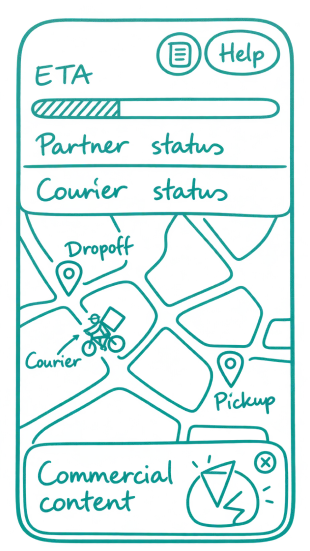
Showing restaurant and courier progress separately, within one overall timeline, would help customers understand delays without contacting support, and give the screen a structure that could host ads without competing with the order status.
05 Solutions
Make progress understandable
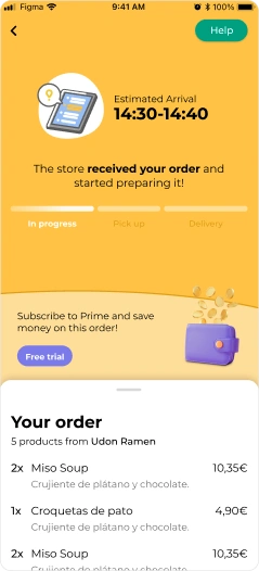
- One overall progress bar
- Separate restaurant and courier statuses
- Explicit stage names
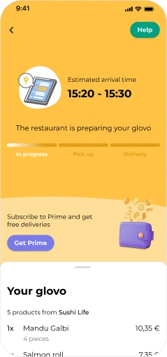
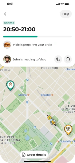
WhyCustomers want updates from both sides at any moment, and a quick-sounding “Pickup” step made 10–15-minute waits feel like something had gone wrong.
Explain what is happening
- Delays attributed to the relevant part of the delivery
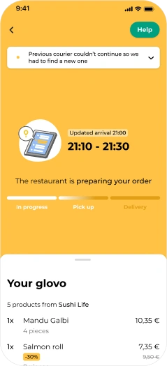
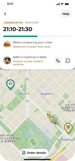
- Transparency about other deliveries along the route
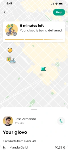
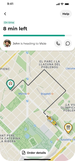
WhyExplaining delay reasons had already reduced the contact ratio by 12 bps. Attributing each delay to the restaurant or the courier made the reason clearer still.
Give customers useful context earlier
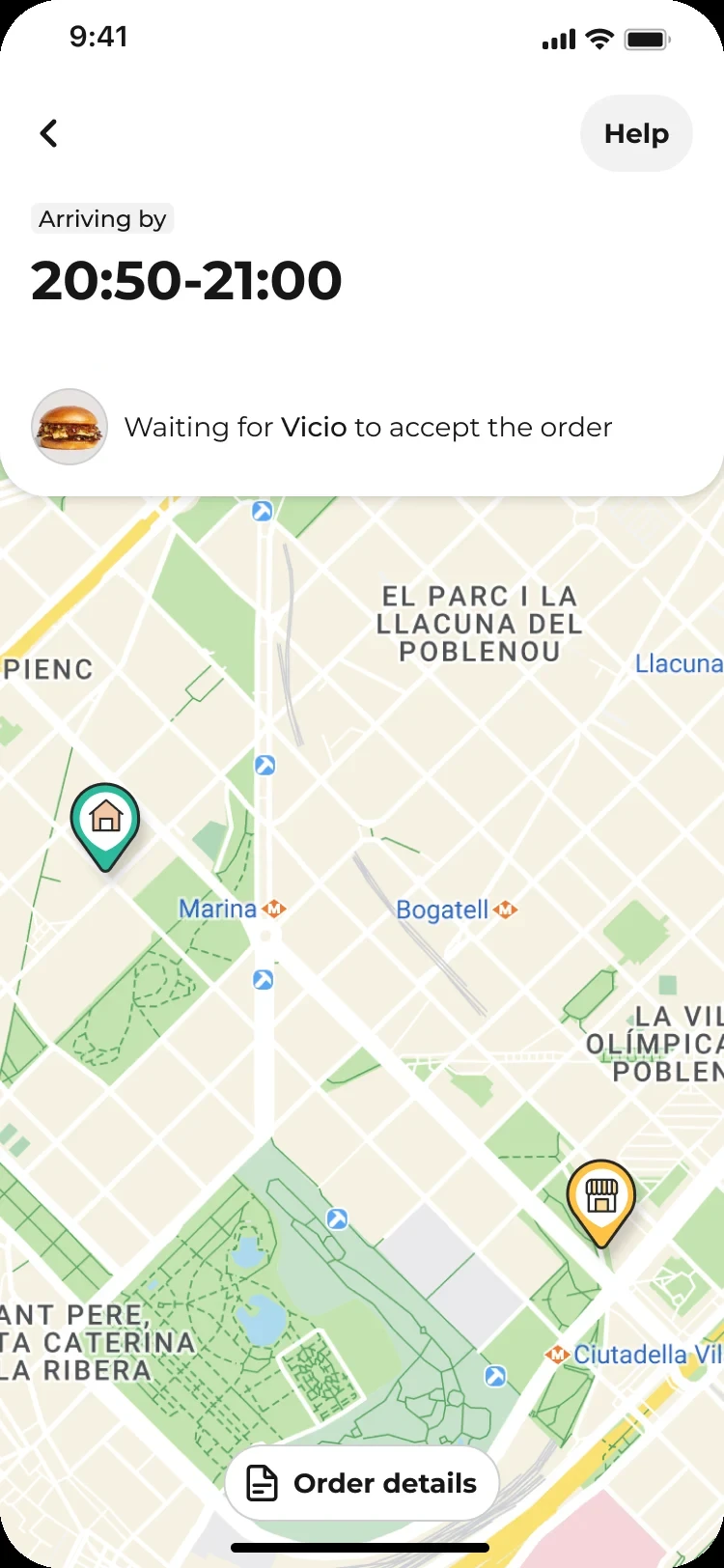
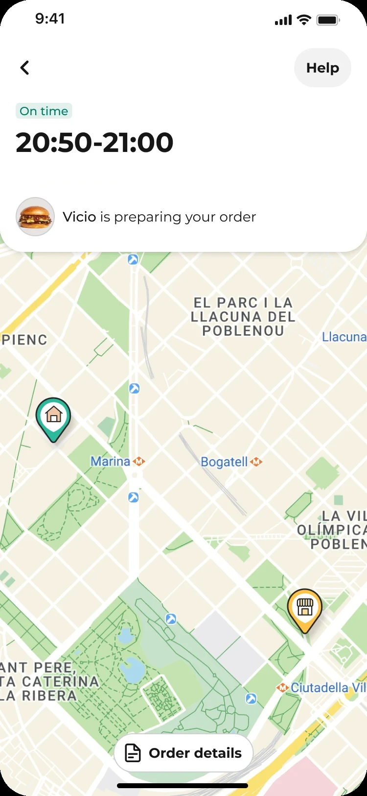
- The map right after ordering
- Recognisable icons for the restaurant and the delivery address
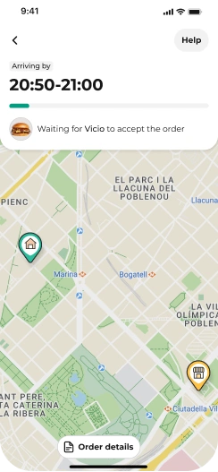
WhySeeing the restaurant and their own address on the map right away helps customers judge distance up front: a restaurant that’s far away, an ETA that seems too long for the distance, or a wrong address. If they decide to cancel, they do it before the restaurant starts preparing.
Make room for ads without losing the order status
The new structure gives commercial content its own place on the screen, while the order information always stays on top.
WhyCross-selling during tracking had increased grocery orders, and the business needed a lasting slot that didn’t compete with what customers came to see.
06 Impact
Lower contacts
Being open about the courier delivering another order on the way cut contacts on bundled orders by an estimated 10–15%.
Earlier cancellations
Moving cancellations before the food was prepared supported customer retention.
Unlocked revenue
The new structure made room for ads worth an estimated €1–2M. I designed the structure, not the ads.
The team rolled out the extended version, including edge cases, after I handed the project over.